-
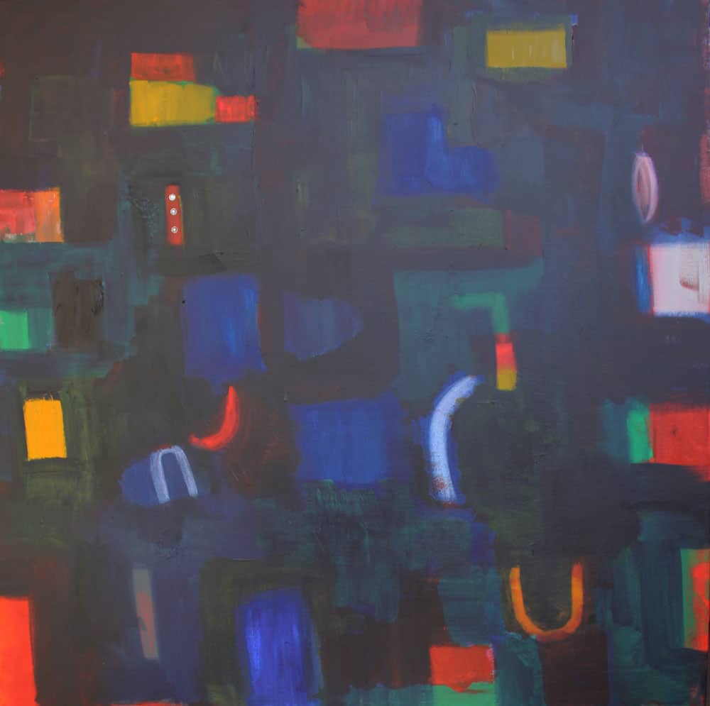
Deep Blue, oil on canvas, 36″ x 36″, $2480
This painting is included in my collection: Form and Feeling. It was inspired by my desire to create a composition which contained only pure color or pure color plus black. In color theory these colors are called shades. This was a challenge as the painting would have an overall dark tone. However, the result is a striking painting with an assemblage of various shades of colors on a very deep blue-purple background. It is available for purchase on my website.
Having just looked at and commented on Nancy’s abstract photo of Times Square, I am in the mindset of thinking of NYC at night. I have always thought your work evoked a “Piet Mondrian on vacation” – meaning the strict formal rules are softened, creating a composition that elicits a “feeling” while adhering to intellectual investigation. As you suggest, shades of color are more likely associated with darkness, with night, and those patches of pure color are like neon lights in Times Square (and much wilder than Mondrian’s Broadway Boogie Woogie!) It reminds me of the sensation of boarding the subway uptown at dusk, while there is still light,, and then getting off and walking up the subway steps to Times Square. Seeing brilliant colors against the black sky – that thrill is in this painting. I am sure it’s even stronger in person, as this is a BIG painting! Exciting memories are hidden in that darkness for me!
This is a painting where the reds and yellows really burst out, it’s a little ironic that it’s called deep blue. I’ll bet this is one that needs to be seen in person up close and far away alternating. I am curious though, do shades of color only refer to the tube colors that are modulated with black, or can they go in the opposite direction as well, being modulated with white?
Diana
According to color theory shades only refer to pure colors plus black. If you then add white to this mixture the color becomes a gray and is called a tone.
In the other direction a pure color plus white is a tint and has the quality of brightness. The impressionists used this color palette to create the feeling of bright light in their landscapes.
The title of this painting is Deep Blue because it is the dominant color of the background which is blue-purple plus black.
Did I answer your question Diana?